Story
Handwave is a Riga startup building palm-scan payments. Long lines at the terminal kill checkout speed. Palm scanning is their bet on making it instant.
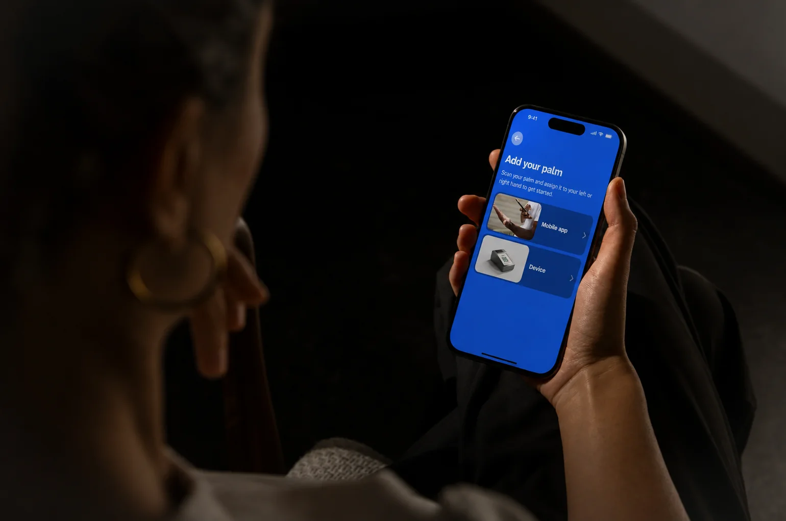
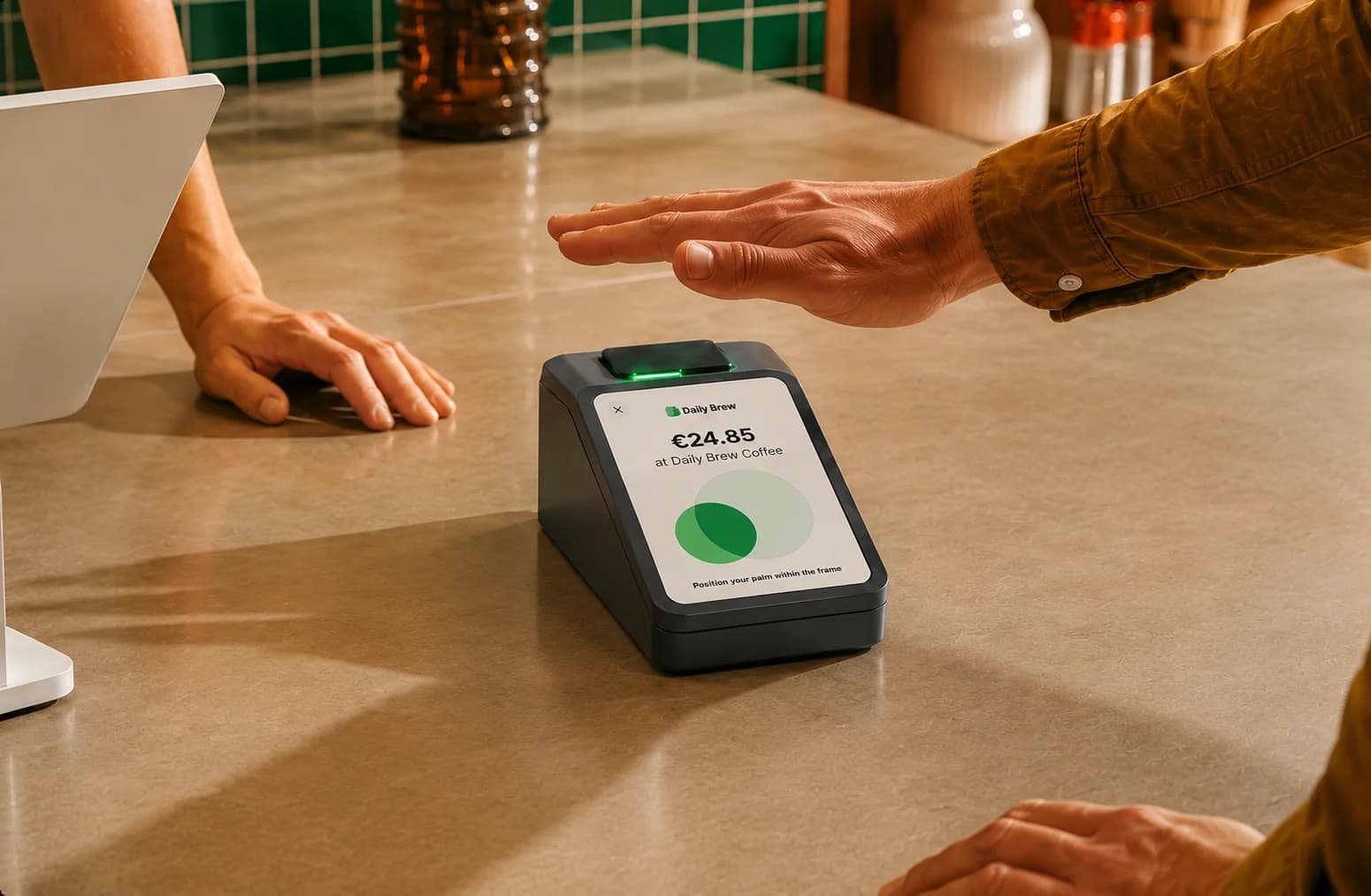
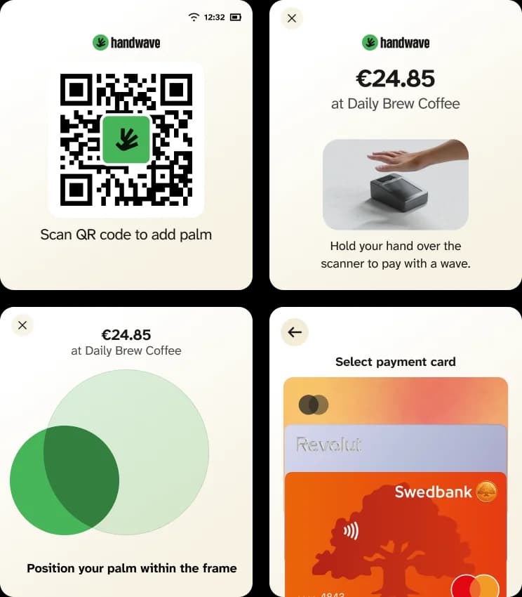
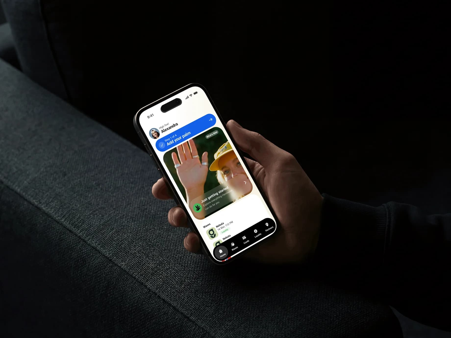
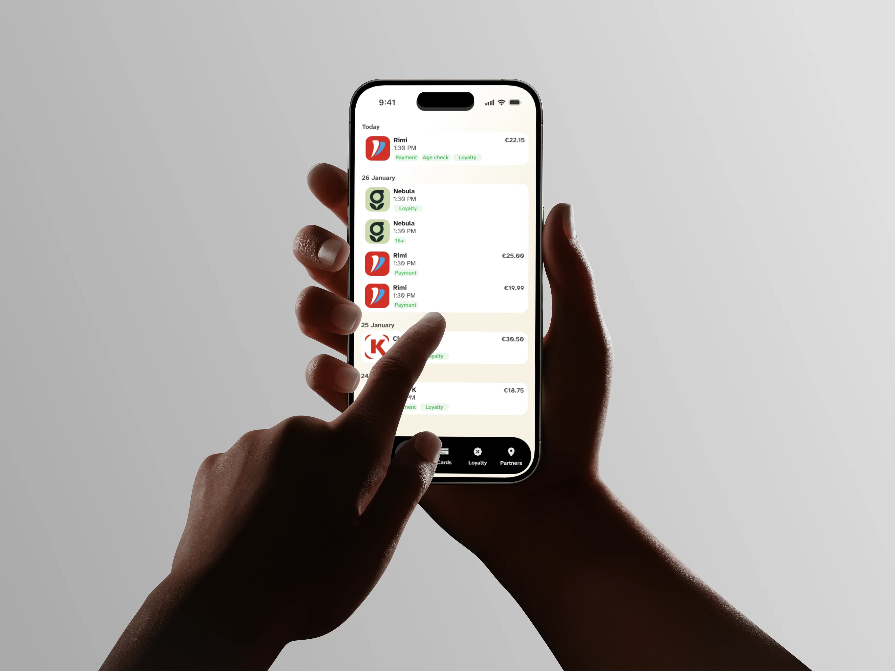
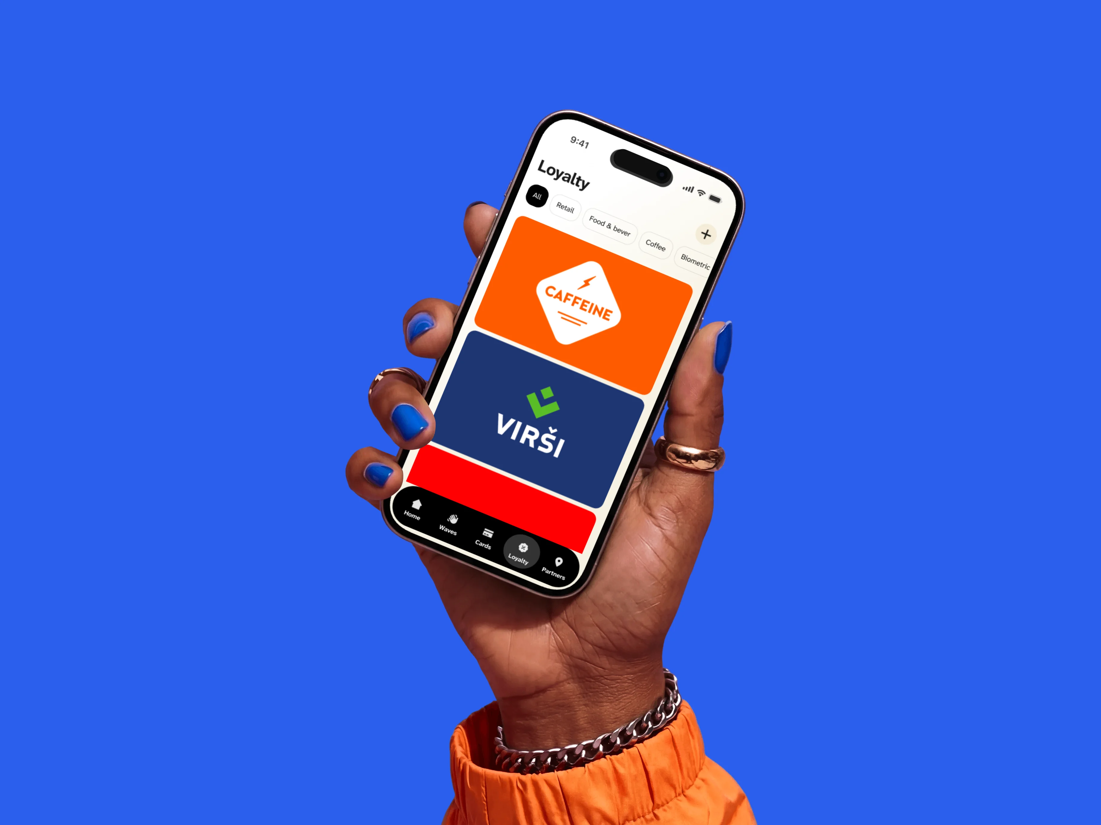
They hired me to redo the UX on the mobile app and the palm-scanning terminal. Both existed, but felt disconnected. Scanning was confusing, and the app had onboarding, navigation, and consistency problems.
Try the real experience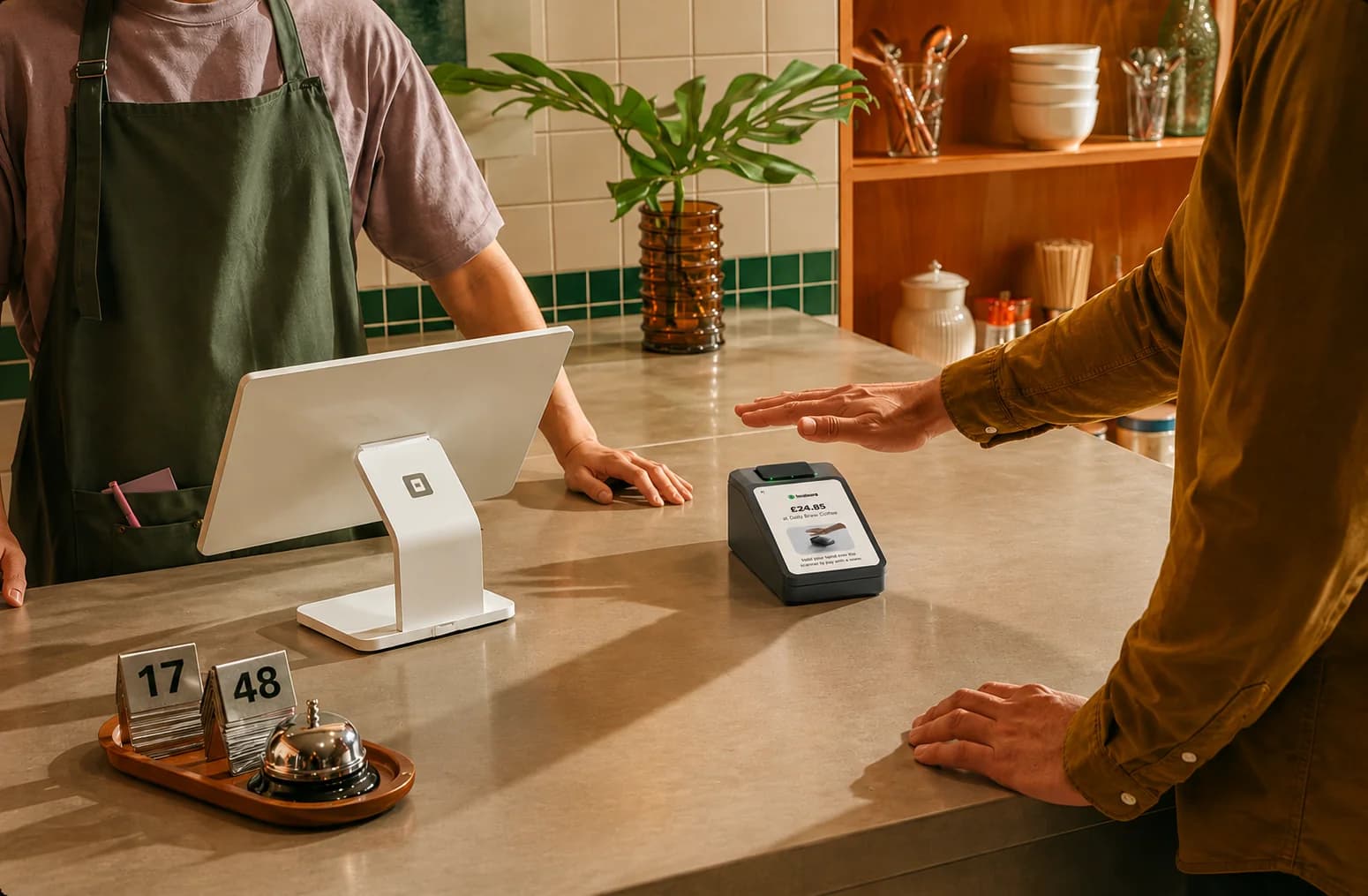
What this project teaches
Watch the checkout, not the mockup
Bob Baxley's advice is to stand at a self-checkout and watch what people actually do. Palm scanning succeeds or fails in that one second at the terminal, so the terminal and the app were designed as one experience, and the app teaches the scan before the first real checkout.
Friction is fine when it explains the benefit
Enrolling a palm is a strange ask. Kristen Berman's work shows that a step which makes the benefit concrete raises completion rather than lowering it. Onboarding leads with paying in a second and only then asks for the hand.
One system across hardware and mobile
Two surfaces built separately feel like two products. Shared states, language, and components make a scan at the terminal and a receipt in the app read as one action.